In addition to designing or overseeing the design of the branding strategies for Monsoon’s clients, the founder, Charlie Szoradi has created these logos for non-profit organizations as well as logos for corporations.
Here are some examples of the corresponding websites, where Mr. Szoradi has extend the branding through online representation:


www.SustainableStoneHarbor.com
www.AiTrainingCourseSolutions.com
www.IndoorGardenTechnologies.com

Here are some examples of corporate identity for Monsoon’s clients:
InstaMed: On July 24, 2019, JPMorgan Chase & Co. (NYSE: JPM) announced that it acquired InstaMed, a leader in the healthcare payments industry for over $500 million. JPM is a leading global financial services firm with assets of $2.7 trillion and operations worldwide, and Monsoon’s founder, Charlie Szoradi was pleased to see that JPM saw the merits of the logo and continues to use it. Mr. Szoradi was also a shareholder of InstaMed, which created added advantages relative to acquisition by JPM.
The following logos include a brief description of the design strategy:
AgileCat: This PR firm’s founder expressed that his company was not the largest or the oldest, but it was the most responsive. So, we leveraged that knowledge through the naming and brand strategy to clearly convey “Agility”. The founder also wanted to break out of the typical PR category, so we coupled “Agile” with “Cat” as a means to support the defining statement “Communications Catalyst”. The abstracted cat graphic further reinforces the overall brand positioning.
Wireless Central: As one of the largest regional Master Dealers for T-Mobile, Sprint, AT&T, and NEXTEL, Wireless Central needed to create a parent brand that could house a growing number of over 100 retailers, many of whom were operating under different retail brand names. To reinforce the brand as a leader in the communications industry for both consumers and businesses, we abstracted the communication metaphor of an antenna through a series of dots that expand outward over the name. The up-beat color and typography combine to form a contemporary brand that has continued to grow and expand.

CyberStream: As one of the early innovators of streaming media, the CyberStream wanted to reinforce their core value proposition in the brand. We reinforced the concept of continual motion through letters that not only have a smooth curvilinear form, but also connected to each other to further reflect the un-interrupted media.

Thinking Sun: For this human resource consulting company, we steered clear of the common graphic representations of improved status such as a set of stairs or a ladder. The yellow color represents the sun, and the elevated single circle above the ring, reflect the positioning strategy and slogan, “Elevate your people. Elevate your profits.”

VIP Wireless: Bright consumer colors and big bold type treatment serve as the anchor for this brand that is one of the largest regional T-mobile Master Dealers. The brand strategy for VIP extended beyond the typical Print, Radio, TV, and Web marketing to include a comprehensive street team and mobile marketing program with custom graphic wrapped RVs that sold phones directly to consumers at community locations and events.
Tidal: The company provides innovative search engine optimization that creates a wave of traffic to the websites for each of its clients. The naming and brand strategy reflect the energy of the “wave” of targeted customer. Rather than just showing a literal Tidal Wave, we abstracted the graphic to convey the multiple streams of momentum that build up as part of the optimization process.
Imagine: A state of the art spa-like facility that breaks the paradigm of traditional service with leading oral pain relief and aesthetic dentistry. We focused on the careful balance between “advanced” professionalism and the sophistication of dental “arts”. The naming strategy and graphic treatment evoked an aspirational serenity that is not typically associated with the dental profession.

Jade: The diversity of Jade’s complex business model inspired a simple and straightforward brand strategy that would encircle all of its divisions. The green color of jade served as the springboard, and it was strengthened through the use of the circle as the dot on the “J” that has an organized cleanliness evocative of Japanese design.
Oldies: The retro color and graphic elements reflect the culture of the 50s and 60s as a means to reinforce the overall brand strategy. As well, the type treatment creates the hierarchy requested by the client to highlight “Oldies” and “98” over and above the support information. The archive photography deployed in the marketing campaign and the slogan, “The Greatest Music of All Time” also reinforce the brand.

Sierra Global: For this leading New York based hedge fund, we reinforced the traditional aspect of the finance industry through the representation of core elements. The abstracted mountain range for “Sierra” and the arc of the horizon for “Global” serve as a straightforward and elegant platform. The familiar deep green also serves to connect the brand to the finance industry.
Philadelphia Construction: We learned that there were three unrecognized divisions within the company, so we helped define the sub-sets as Development, Renovation, and Management. The branding symbol represented the company as a set of those three interconnected building blocks. We further structured the brand with colors such as concrete gray and slate blue that come from the culture of the construction industry.
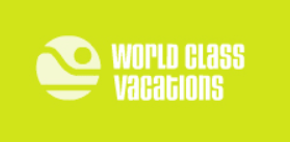
World Class Vacations: The company is one of the oldest and largest providers of spring break travel in the US. The company reaches the youth market and partners with MTV on events, so it wanted to update its overall brand image. The old logo literally illustrated a topical island with a setting sun. We transformed the graphic through an abstracted representation that also reflects the upbeat recreational aspect of the business through a swimmer diving into the water.

American Swedish Historical Museum: ASHM asked us to bring contemporary relevance to its branding, evoke an elegant sense of Swedish design, and also create a feeling appropriate to a leading historical institution. We achieved this by using a common color used in Swedish tapestry design, combined with type treatments of both American and Swedish origin.
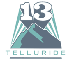
13 Telluride: The scenic mountains of Telluride Colorado, served as the inspiration for the brand development of this regional TV Channel. The color also serves as a familiar component of the graphic treatment that has a solid presence and an energy force that plays into the spirited outdoor culture of the community.

SelliQuest: The company provides a suite of multiple technology services to eight of the largest pharmaceutical companies in the world. The services focus on increasing sales, so we defined the new brand name, logo, support graphic and tag line “Accelerating Sales through Applied Technology” to reflect synergy and a potent growth trajectory.